Halus 90

Featuring a paper customised in-house to mimic the effect of pastels and gouache on the page, Musubi's new Halus paper is the purest expression of play.
To create, sans fetters
Pastels, watercolours, paints, gouaches — the mediums and tools of an artist's trade, and avenues for creation, but not necessarily the most convenient to carry around from day to day. What if we could apply the principles of modern paper chemistry towards mimicking the effects of these mediums, except using regular fountain pen inks — allowing us to play and create more freely with fewer barriers?
That's the question the atelier set out to answer with its second foray into Project Tabula, our in-house project for creating and customising paper to suit specific, specialist needs. Leaning away from the everyday work focus of our Rasa paper, we wanted to make a paper that would focus entirely on the way colour and light play across its surface, concentrating primarily on beautiful, soft colours, and vivid, expressive sheen.

On the properties of modern matte coat
The paper coating of a modern coffee table photobook, much the sort you'd see scattered artfully around the lobbies of expensive hotels, is configured primarily for the pop of colour necessary to making beautifully shot photos shine on the page. Our goal was to take a coating of this nature and see if we could unlock it for the creative process of the hand, softening colours and giving fountain pen inks the look of pastel or gouache on the page.
In order to do this, we took a close look at how the chemistry and application of the paper's coating affects colour expression — specifically, the way inks bond with both the coating and the underlying paper. After quite a lot of experimentation and a lot of spilt ink, we believe we've created something both soft and expressive — a joy to colour in and a joy to paint on.
Say hello to Halus, the second in-house paper from Musubi — one made for the express purpose of expression, art, creation, and play.
halus (hah-loose): fine, delicate, in Straits Malay

A complex layering of soft colours
Halus is defined primarily by the following properties:
- a softening of colours, almost akin to the look of Nicker gouache on paper (as visible below);
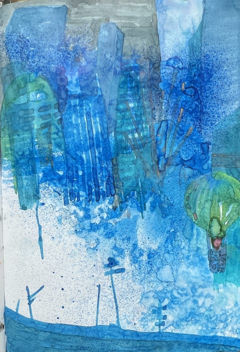
- and pronounced pooling of inks, resulting in extremely noticeable sheen where the ink concentration is highest.


Applied lines spread on the page but form clean, hard edges at their borders, with sharp differences in shading between the beginning and ending of strokes:


The paper itself abhors sharp instruments like needlepoints, which slice through the specialised coating. Instead, it wants primarily to be used with wide points, including broad nibs, fude nibs, and brushes, which bring out deep shading behaviours:

Inks dry in individual layers, becoming water-resistant and allowing you to paint over them without mixing wet:

Our art consultant, Leigh Reyes (@leighpod), who provided all these samples, describes it as "making everything look like a Ghibli palette, or a hazy dream", with the special coating giving everything a substantial matte finish that looks more painted on than inked over.
This is a paper that wants you to engage with it in full, to experiment and to play, to build inks and washes one atop the other. It's the result of years of hard work and passion from all of us here at the atelier, and we can't wait to see what you do with it.

An ever-present companion
The Halus folio notebook, like all its compatriots, is bound in Japan by a small, family-owned bindery, bringing you the same incredible build quality you're used to in our other folio notebook offerings.
A deep blue bookbinding cotton and an almost-invisible debossed logo on the front cover keep the attention squarely on your work and not your tools, while an ample 208 pages of our new Halus paper hold everything from your shopping lists to that unfinished novel to your plans for that end-of-year holiday. And all that paper is kept in check by a Smyth-sewn binding, not glue — so it lies flat when open, just like our signature handbound journals.
Design is in the details
And, as usual, we didn't skimp on the internals, either. The atelier's renowned attention to detail comes through in our unique lined and cross grid paginated rulings, speciifically created to provide maximum usability and flexibility to your workspace.

Our lined ruling features 7 mm lines, with markers on the top and bottom edges to help you quickly find the midpoint, thirds and fourths of each page.

Our paginated cross grid is designed from the ground up with thoughtful integrations that add utility and maximise readability:
- crosses 1.2 mm wide, spaced 5.12 mm apart;
- small triangles on all four edges marking the middle of each edge;
- page numbers on the bottom outer edge of each page;
- an X in the very centre of the grid, for centring graphs and drawings; and
- dashes every five rows on the vertical edges, which function as line counters.
Use these delineators to set your page up for bullet journalling, add Cornell margins, or simply draw graphs and charts — they're subtle enough to stay out of your way but be there when you need them. The freedom is yours.

The Tomo system: designed for life
Our folio notebooks are a component of the atelier's signature Tomo system: a swappable, refillable combination of covers, notebooks and notepads designed to be your constant companion for the everyday.
Socially conscious craftsmanship
Proceeds from the sale of these notebooks help fund the atelier's social impact work on disability employment and support for indigenous communities around the world.